The most popular way is install addon
https://addons.mozilla.org/en-us/thunderbird/addon/importexporttools/
Download, Install, Restart and import in your specified folder. Instructions are also found on the download page
Saturday, April 25, 2015
Tuesday, April 21, 2015
Mac: How to add alternative lines in Excel etc
if you have a column
36166
19764
37658
36244
29998
How can you transform it to
36166
19764
37658
36244
29998
?
The answer is using TextEdit.
1. Open TextEdit
2. Copy a line break (the part between the end of 36166 and the start of 19764)
3. command + f, paste the line break in the searching area, check replace
4. Paste the line break twice in the second box to replace one line break with two line breaks. In this way you will insert one line after each original line. To get more line breaks, do the same.
36166
19764
37658
36244
29998
How can you transform it to
36166
19764
37658
36244
29998
?
The answer is using TextEdit.
1. Open TextEdit
2. Copy a line break (the part between the end of 36166 and the start of 19764)
3. command + f, paste the line break in the searching area, check replace
4. Paste the line break twice in the second box to replace one line break with two line breaks. In this way you will insert one line after each original line. To get more line breaks, do the same.
Thursday, April 16, 2015
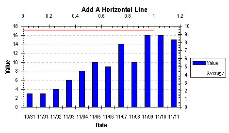
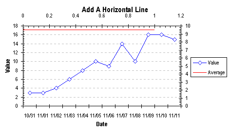
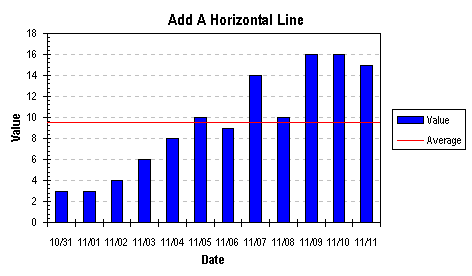
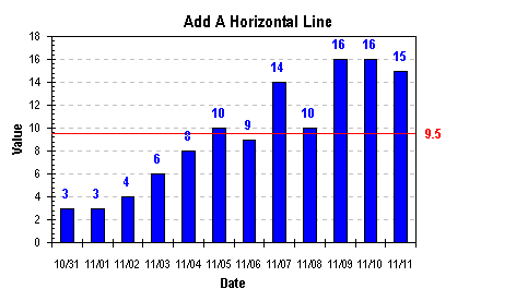
How to add a horizontal line onto bar charts in Excel 2013.
In short:


1. input this anywhere:
[blank]    Average
   0         9.5
   1         9.5
2. copy that table region.
3. Click on the chart you want to add the horizontal line on, then click on the paste -> paste special (at the top left of excel tools panel) -> add new series
4. select the newly added series, right click -> change chart type
5. check that series, select scatter XY type, plot of secondary axis
6. click on the markers twice (not double click), right click -> format marker -> under the fill logo, choose the "None" as marker style.
A detailed explanation is here: http://peltiertech.com/Excel/Charts/AddLineHorzSeries.html
or ,
below:
Add a Horizontal Line to a Column or Line Chart: Series Method.
How do you add a nice horizontal line to a column or line chart, to show a target value, or the series average? The method involves adding a new series, applying it to the secondary axes, and making the secondary axes disappear.
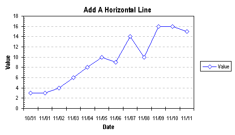
Use this data to make a column or line chart. The blank cell in the upper left of this range tells Excel that "Value" is the series names, and the dates in the first column are the category (X axis) labels. (I use dates in this example, but you could use any type of category labels.)
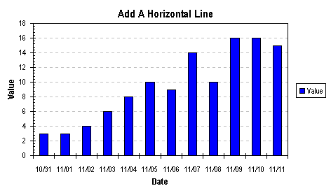
[blank]    Value
11/11/02     15
11/10/02     16
 11/9/02     16
 11/8/02     10
 11/7/02     14
 11/6/02      9
 11/5/02     10
 11/4/02      8
 11/3/02      6
 11/2/02      4
 11/1/02      3
10/31/02      3
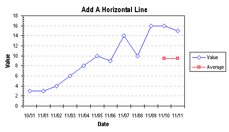
In a free section of your worksheet, set up a range with X and Y values corresponding to the endpoints of your indicator line, shown below. The X value ranges from 0 to 1; we will use the secondary X axis for this line, and scale its min and max to 0 and 1. The Y value corresponds to an average or other significant level you want to indicate on the chart.
[blank]    Average
   0         9.5
   1         9.5
Select and copy this range, select the chart, and from the Edit menu, choose Paste Special. Select the New Series, Categories in First Column, and Series Names in First Row options. The new series has the same style (Column or Line) as the first series.
Right click on the new series "Average" and select Chart Type from the pop up menu. Choose the XY Scatter type, subtype Scatter with data points connected by lines without markers. The series changes and secondary axes appear on the chart.
Now it's time to neaten up the axes. Double click on the secondary X axis, and on the Scale tab, set 0 for Minimum and 1 for Maximum. On the Patterns tab, choose None for Major and Minor Tick Marks and for Tick Mark labels to make the axis disappear.
Select the secondary Y axis and press Delete (or more formally: right click on the chart, choose Chart Options from the Pop Up menu, click on the Axes tab, and uncheck the box for the Secondary Y Axis).
All that may be left is some embellishing of the chart. I removed the legend, added data labels (Show Values option) to the original series, and a data label to the last point of the horizontal line series (see Label Last Point). Then I colored the label text to match the series color.
VertizontalLine.zip is a zipped workbook that shows this technique and others for reliably placing a vertical or horizontal line on your column or line chart, using a dummy series or a dummy error bar. Here are some related pages on this site:
Thursday, April 9, 2015
Apps that are useful when you use a smart phone (moto g)
Time and location:
Google Calendar,
Sleep Cycle,
The Weather ...
Clock
Google Map
RunKeeper
Account:
Keeper
Chase
BofA
Caltech EF...
Discover
T-mobile...
UHCSR
Music:
Pandora
Spotify
Perfect Piano
SoundHound
Tools:
QR Code R...
Flashlight
Office:
Drive
Translate
Dropbox
Evernote
Gmail
Social:
Hangouts
Facebook
Twitter
Weibo
WeChat
Messenger
QQi
Easychat
LinkedIn
Lifestyle:
Yelp
Uber
Amazon Student
Douban
Contacts:
Contacts+
Developer:
Serveraudit...
AnyConnect
Google Calendar,
Sleep Cycle,
The Weather ...
Clock
Google Map
RunKeeper
Account:
Keeper
Chase
BofA
Caltech EF...
Discover
T-mobile...
UHCSR
Music:
Pandora
Spotify
Perfect Piano
SoundHound
Tools:
QR Code R...
Flashlight
Office:
Drive
Translate
Dropbox
Evernote
Gmail
Social:
Hangouts
Messenger
QQi
Easychat
Lifestyle:
Yelp
Uber
Amazon Student
Douban
Contacts:
Contacts+
Developer:
Serveraudit...
AnyConnect
Subscribe to:
Comments (Atom)